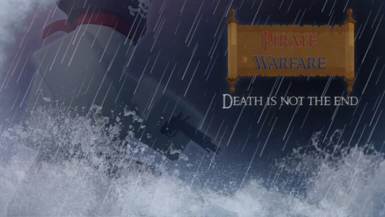
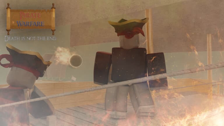
Sure, I agree, they’re very high quality. But the message in the thumbnails are a bit strange… ![]()
my second and third ever gfx (even tho i think this was 2023) for one of my games cs i was too lazy to find a gfx designer to hire
(for the first one blender wouldn’t let me add clothes
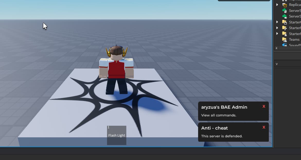
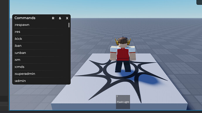
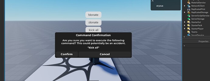
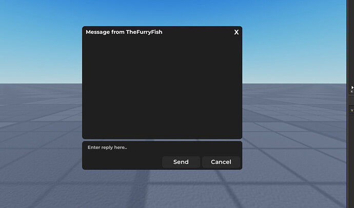
Inspired by @cam , I have set a mission to revamp the old and boring BAE 2.0 UI. I changed (I think) every font to Monsterrat and used different boldness for each one. I also removed change the colour of it to a darker grey. Hope you guys like it! If you have any suggestions, please reply with them. Heres some screenshots.
I do like the deeper shade of black, however, isn’t V3 supposed to release some time this year?
Personally, reminds me of Coast’s Basic Admin just a little different. I really like it!
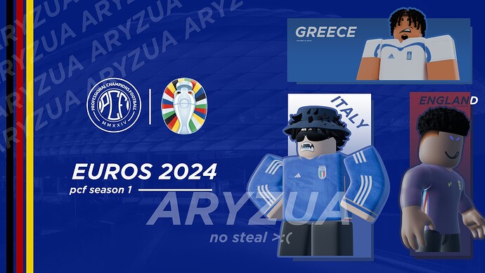
Rate this! Spent me an entire hour for each render and my photopea crashed 5 times ![]() . Overall, it took me about 5-6 hours and this is for my roblox MPS League!
. Overall, it took me about 5-6 hours and this is for my roblox MPS League!
Suggestions if you can.
Damn, I do like this, a lot. This is pretty much perfect, although perhaps everything could be brightened, really depends on the game style though.
Looks pretty good! I do agree with @Noah, the buttons should especially be brightened up. I also believe the button layout could use some work (such as the red button, where the “England” text continues out of the box) … otherwise looks great!
I thought the england text would be a cool effect but it does look quite wierd, i will admit. and the gradient on the frames are used from the kits, i thought it would be more unique. But thank you for the feedback!
Woah! That looks insane, great job!
hmm, it looks good iwl but the font is kinda weird. You could use oceanwide OR gotham. and then i think it would look better. It is still very nice!
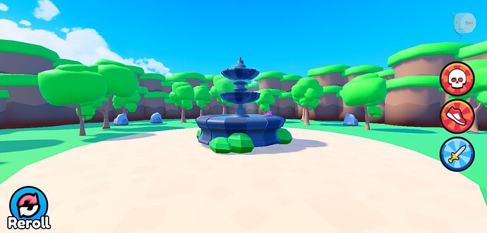
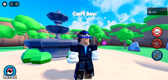
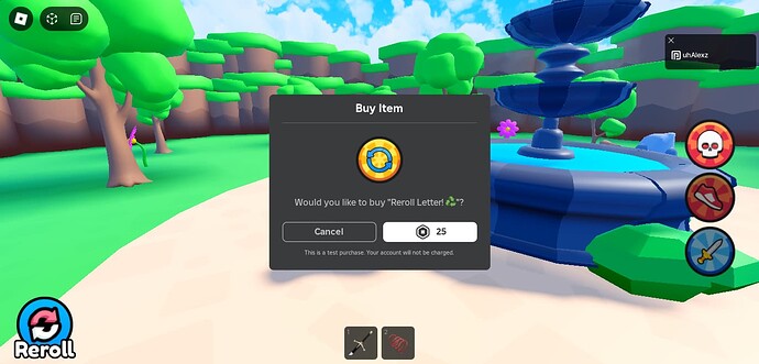
I’ve recently been developing a game named “Can’t Say the Letter! ![]() ”, and I just wanted to share some screenshots of my game and I want to know any revisions I should add!
”, and I just wanted to share some screenshots of my game and I want to know any revisions I should add!
Looks good, but, why would people play this?
For fun, maybe? You just made me realize my game is useless ![]()
@uhalexz, your game looks good in all but the mdeols inside the game look repeated. For the borders, maybe rotate them and dont let the grass on the top collide with other grass from other borders. Also, the gui looks kind of bland and the tools are pointless to. Why would you need a sword and speed coil?
Take it as a learning experience.
Love it,
you should go advertise to the people jeffy screwed over and offer conversion keys. ![]()
Early preview of my Apartment / Office buzzer system.
Ignore the part falling at the start ![]()
