Hello, and thank you for checking out my tutorial on how….
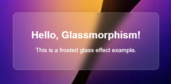
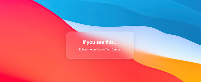
Hello, and thank you for checking out my tutorial on how you can make this super clean and modern glassmorphism effect. Please note that for his you will need basic HTML and CSS knowledge.

Before we begin…
Before we begin, you will need to understand the basic structure of HTML and CSS. If you don’t, I’d recommend using w3schools to start your HTML journey.
For this, we will be using a single HTML file- which you will need to set up yourself beforehand.
How are we going to do this?
To accomplish this clean effect, we are going to be using the <div> element, along with our custom variable (glasscontainer).
Integrated in this script, will some CSS values like <style>, which is inside of the <head> section.
Getting started…
To start off we are going to be adding the CSS. To do so, you are going to need an image- im using my own, however you can use your own image. (for those who want it, my image url is https://i.postimg.cc/qMnNPy3P/image.png).
This code the background to a specific image and ensures it covers the entire screen without repeating. We are also going to be making the font Arial Sans-Serrif, but you can change this if you’d like to.
<!DOCTYPE html>
<html lang="en">
<head>
    <meta charset="UTF-8">
    <meta name="viewport" content="width=device-width, initial-scale=1.0">
    <style>
        /* Set up a basic background */
        body {
            margin: 0;
            height: 100vh;
            display: flex;
            justify-content: center;
            align-items: center;
            background-image: url('https://i.postimg.cc/qMnNPy3P/image.png');
            background-repeat: no-repeat;
            background-size: cover;

            font-family: Arial, sans-serif;
            flex-direction: column;
            gap: 2rem;
        }
Now that we have done that, we are going to need to define our custom variable, ‘.glasscontainer’. We are going to do this by going down a few lines, and add the following key properties:
background: rgba(255, 255, 255, 0.15);: This makes the container’s background slightly transparent so you can see through it, but not to much…backdrop-filter: blur(10px);: This applies a blur effect to the background of the container, making it look more frosted.box-shadow: 0 4px 30px rgba(0, 0, 0, 0.1);: This adds a soft shadow around the container, making it pop out.border: 1px solid rgba(255, 255, 255, 0.3);: A light border around the container to make it pop out even more.
After that, your code should be looking like this:
.glass-container {
            background: rgba(255, 255, 255, 0.15);
            border-radius: 15px;
            padding: 2rem;
            text-align: center;
            max-width: 400px;
            width: 100%;
            backdrop-filter: blur(10px); /* Apply blur effect */
            -webkit-backdrop-filter: blur(10px);
            box-shadow: 0 4px 30px rgba(0, 0, 0, 0.1); /* Soft shadow */
            border: 1px solid rgba(255, 255, 255, 0.3); /* Light border */
        }
You may be seeing some things in there that I didn’t explain, so let me tell you-
- The
border-radius: 15px;makes it so the corners are nice and round, giving it a modern look. - The
text-align: center;makes it so all of the text stays in the center of the box, not left or right. - The
-webkit-backdrop-filter: blur(10px);is there for people that will view this onSafariwill be able to see the blur effect aswell.
Editing how the text looks…
We want the text to have different variations, so for the title (h1), we will add this code underneath the .glasscontainer code:
.glass-container h1 {
            color: #fff;
            font-size: 2rem;
            margin-bottom: 1rem;
        }
And for the body of the text, we will put this code underneath the code above:
 .glass-container p {
            color: #fff;
            font-size: 1.2rem;
        }
    </style>
Now, we have closed the styling off, we can now make the box! To do so, code up the <head> bit, and then open up the <body>
Now, we want to link the .glasscontainer to the box, so we will use <div class="glass-container"> to do so.
Now you can enter your text inside of it using <h1> and <p>. Simply just close off the <div> with </div>, and also close off the <body> and <html>.
Your code should now look something like this:
</head>
<body>
    <div class="glass-container">
        <h1>Hello, Glassmorphism!</h1>
        <p>This is a frosted glass effect example.</p>
    </div>
</body>
</html>
With all of that, your code should look like this when it’s completed:
<!DOCTYPE html>
<html lang="en">
<head>
    <meta charset="UTF-8">
    <meta name="viewport" content="width=device-width, initial-scale=1.0">
    <style>
        /* Set up a basic background */
        body {
            margin: 0;
            height: 100vh;
            display: flex;
            justify-content: center;
            align-items: center;
            background-image: url('https://i.postimg.cc/qMnNPy3P/image.png');
            background-repeat: no-repeat;
            background-size: cover;
            font-family: Arial, sans-serif;
            flex-direction: column;
            gap: 2rem;
        }

        /* Glassmorphism container */
        .glass-container {
            background: rgba(255, 255, 255, 0.15); /* White with transparency */
            border-radius: 15px;
            padding: 2rem;
            text-align: center;
            max-width: 400px;
            width: 100%;
            backdrop-filter: blur(10px); /* Apply blur effect */
            -webkit-backdrop-filter: blur(10px); /* For Safari */
            box-shadow: 0 4px 30px rgba(0, 0, 0, 0.1); /* Soft shadow */
            border: 1px solid rgba(255, 255, 255, 0.3); /* Light border */
        }

        /* Text styles */
        .glass-container h1 {
            color: #fff;
            font-size: 2rem;
            margin-bottom: 1rem;
        }

        .glass-container p {
            color: #fff;
            font-size: 1.2rem;
        }
    </style>
</head>
<body>
    <div class="glass-container">
        <h1>Hello, Glassmorphism!</h1>
        <p>This is a frosted glass effect example.</p>
    </div>
</body>
</html>
Now you have a working glassmorphism effect using HTML and CSS. You can use this as a foundation for creating beautiful user interfaces, cards, or any other elements that require this modern design style. Experiment with different backgrounds, text, and styles to make it your own!

Thanks,
@yelnatsz
