Check-In + | Development

Greetings! Me and @Boo are currently making a brand new ROBLOX Check-In System!


So far, there are 2 versions. Check-In + and Check-In Ultimate.


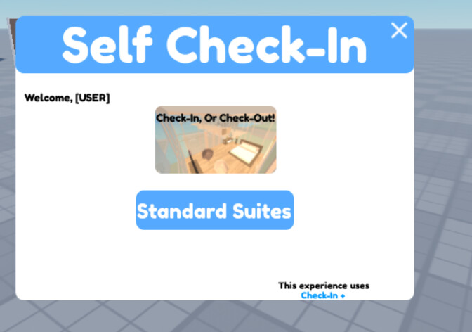
Check-In + is entirely free, but lacks in features. We only allow 1 room type for the free version.
Check-In + comes with a self check-in, as we are currently working on a standard staff check-in.


Check-In Ultimate, which will be 100 robux, will include all of the features, with a point system, unlimited rooms, 2 room types, and much more. Me and @Boo will edit this post when we get more updates!


Screenshots!
image

CHECK OUT OUR PROGRESS HERE! Hotel System - Roblox


Thank you,
@HayHay

(please note that currently, the self check-in is currently FULLY scripted, but we will add more.)

UPDATE: The button “ripple” effect is currently buggy.

UPDATE: Fixed the ripple effect. Post below if there is any bugs!

Checkout Bug:

1 Like

Join the game. Lemme see. :smiley:

the ripple effect/checkin background always has errors, but does not effect anything

Seems to, it doesn’t remove my card?

1 Like

weird… it does for me… join the game

You probably know this but, the Check Out doesn’t work.

When I put off my ticket it gets rid of it and wants me to check-in again?

you can check in again.

you dont have to. we are currently working on the open/close script

The system works fine for me, however, the UI has uncentered elements, and it just overall seems a bit “messy”.

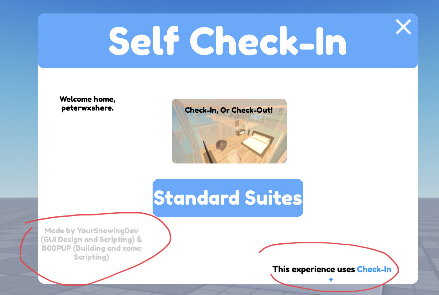
The “Made by…” isn’ touching the bottom and that annoys me - and the “Check-in+” waster mark has the + on another line. Also, the “Welcome home, peterwxshere” is also un-centred. Additionally, the little box with photos was very confusing, as I thought I had to click it.

Otherwise, like I said, the system works, but the “Fetching API” UI button never removes itself - and I’m unable to check in again.

3 Likes

want to help us? :slightly_smiling_face: hahah

I personally agree with @peter. As a UI designer myself, I can tell you that you probably need a better way to organize and improve the current UI elements. Perhaps a better color scheme would improve this, too.

1 Like

Maybe also make the UI draggable, the cookie tech check in system, can be dragged around so that users can look around when checking other users in.

2 Likes

it used to, but it broke- lol

Oh! This reminds me…

What makes your system different from CheckMeIn or the Cookie Tech one?

Why should users choose yours over those? Is there a special feature?

Sorry - I’m pretty busy at the moment and wouldn’t be able to.

It’s free, so they don’t need to pay for CheckMeIn.
It’s open source so it can be edited.