Hey everyone!
I recently created this country statistic UI for a commission. How would you rate it, and if there was anything I could change, what would it be? The image of my UI is below;
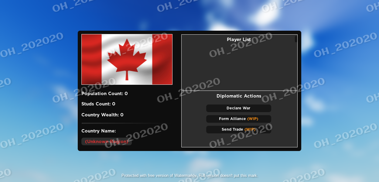
Any resonable feedback is appreciated! ![]()
Hey everyone!
I recently created this country statistic UI for a commission. How would you rate it, and if there was anything I could change, what would it be? The image of my UI is below;
Any resonable feedback is appreciated! ![]()
Note: The Canadian flag is a place holder, any flag can be there. “Unknown Region” is also a placeholder text for the country names.
I’d personally remove the flag, it takes up room within the UI for more features.
Really? I think some graphics would look nice.
I don’t, the flag is taking up to much room and it removes extra features to be added.
Looks pretty good, I like the borders & the theme.
However I’m leaning to agree with this point.