Greeting, Cookie Tech!
So I was in the middle of a commission for a friend of mine and I wanted to get some feedback as I am interested in what you all have to say about this.
I like it, This is my own opinion but I like the new version of CheckMeIn, If you want it you can get it here: Enterprise or Standard. I feel it looks nicer but if you don’t it’s fine.
Can you turn up studio resolution and update the images on the post?
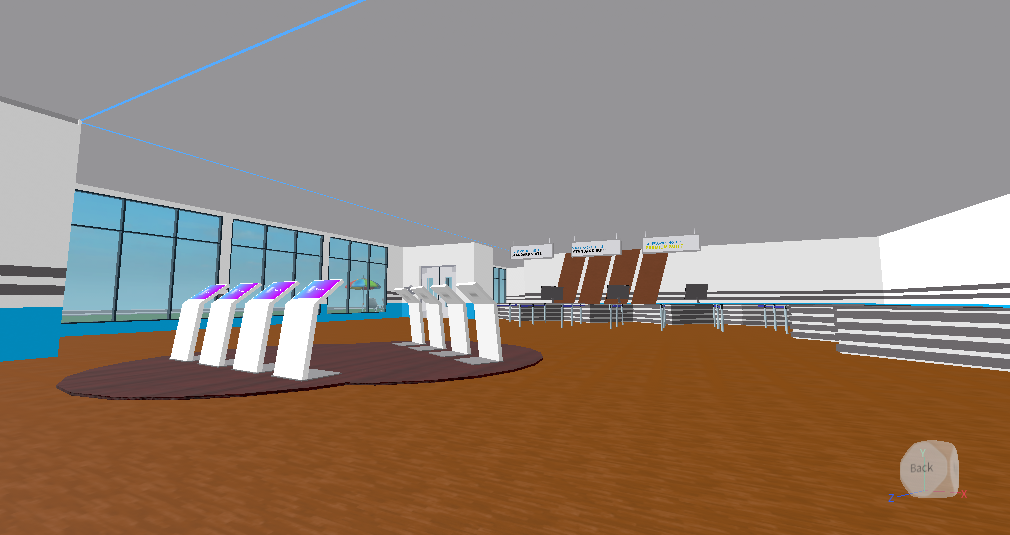
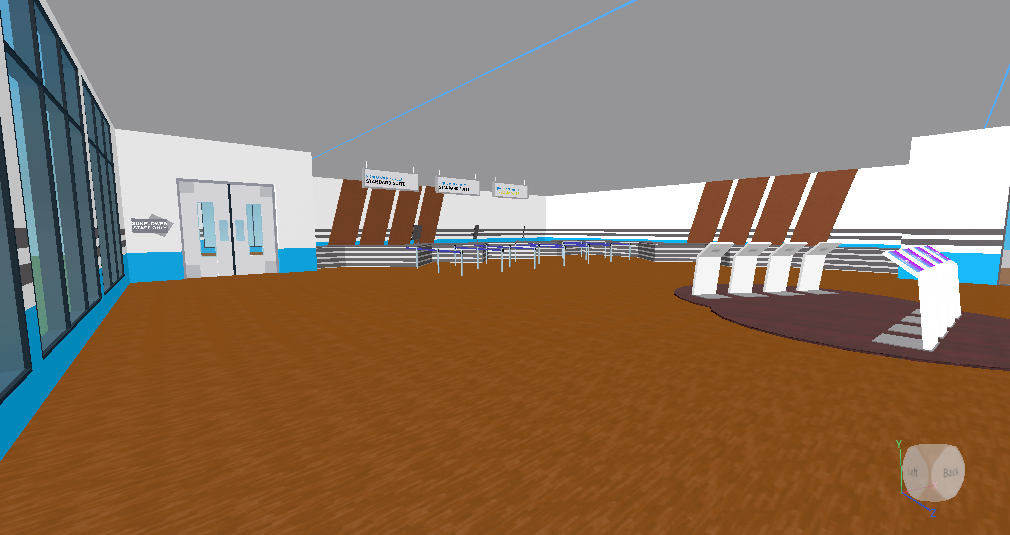
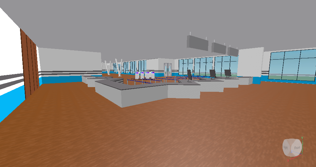
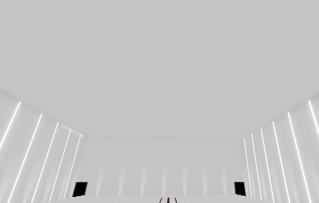
I think that the room is a bit too spacious, maybe trying to size it down will help, also I’m not so keen on the wood floor mixed with the low poly walls.
Also the ceiling is a bit bland, maybe some lighting, shapes or other things will help.
As cookie mentioned, if you turned up your Roblox Studio graphics we could see the lighting effects better. Personally I believe it could have more stuff in it, such as plants or maybe some pictures hanging on the walls for some better looks.