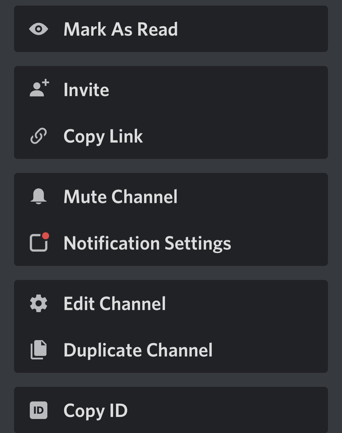
Discord had recently released a new UI. In my opinion it looks ok. I’ve only really seen this design change when you go to managing a channel on your server. If you don’t have it. Here’s an example.
Discord’s UI has been improving a lot over the past 1-2 months, it really gives off a good effect … they did a great job with blending in the buttons with the background.
I’m okay with the new font, but it just looks bad in certain places such as servers, it just doesn’t fit in well there.