New Roblox Logo | Thoughts?

Hello, Cookie Tech!

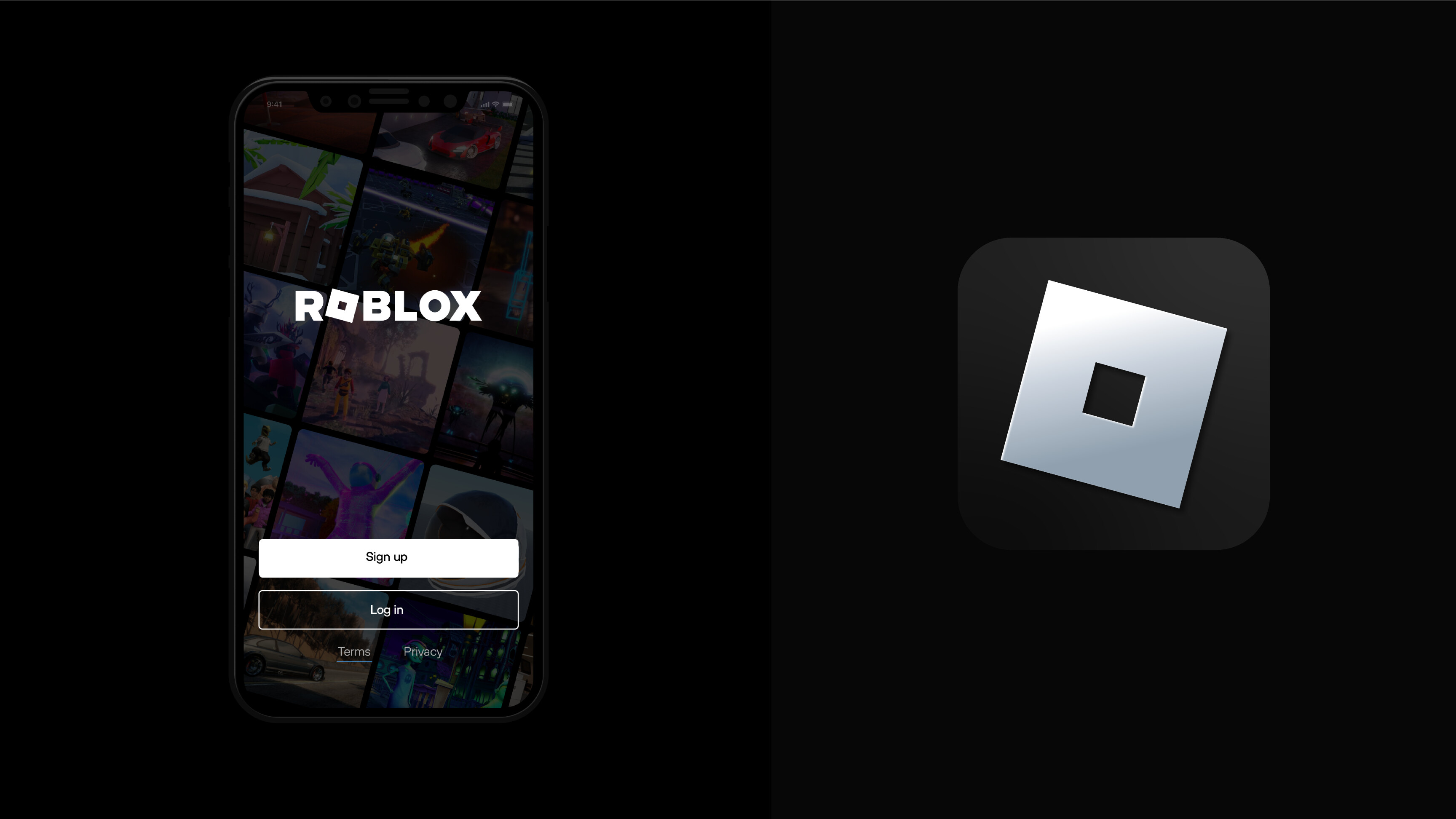
A few days ago, a NEW logo and typeface was found in the ROBLOX code/api (not sure which one, sorry)! It’s set to release in v542, we’re currently in v540.

This is the first time roblox has made any major changes to their logo in 5 YEARS!!

Here is the new logo(s)!


I think the hole is really big, but what do you think?

Regards,
@peter :pineapple:

2 Likes

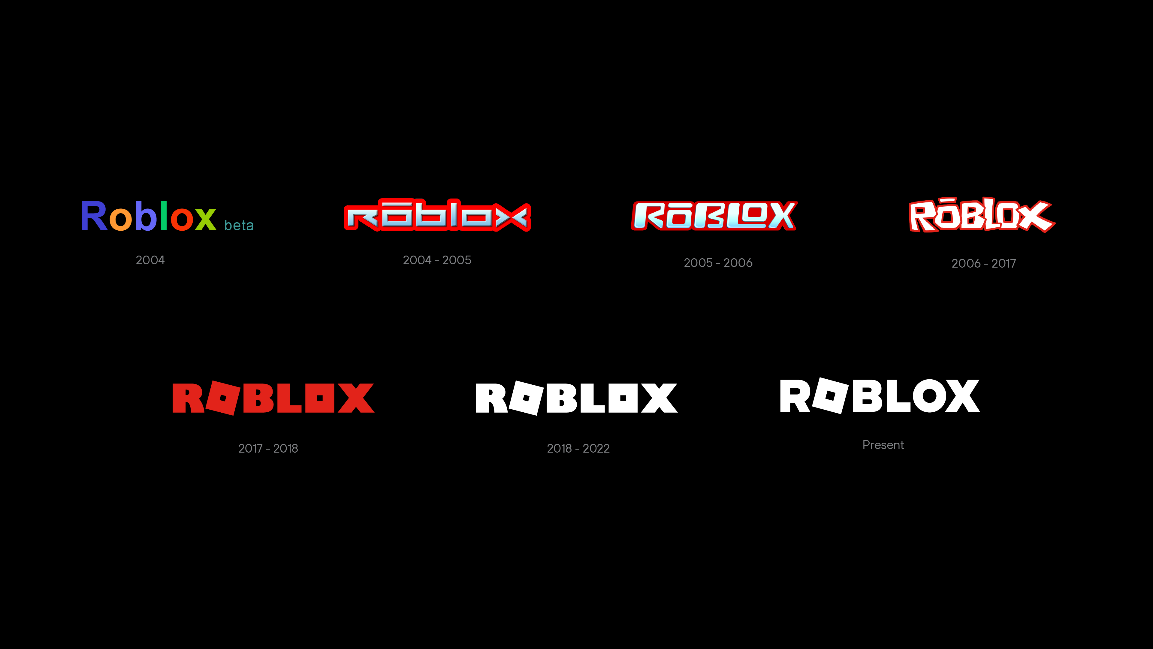
I don’t really see how people care THAT much about the logo. Sure in the past when it made its first big changes from 2004-2017 I could see why people cared then.

But honestly at this point its just like they change the color, or make it bold, next thing you know they’ll probably put it back in italics (2005-2006). At the end of the day it’s still the Roblox we know and love.

2 Likes

That’s true, but for me it’s just that hole, it looks really weird.

I literally couldn’t care a singular piece about this, why are people freaking out about this, they’ve just made it look more like an “O”?

It makes more sense anyways, it’s now a bit more softer and approachable.

It’s fun to see when anybody joined relating to the logo though. :slight_smile:

You can see the companies “rebranding” - (Becoming more simple because they’re more recognisable):

1 Like

it’s horrible just horrible

I’ve been aware of this logo change, too … it’s not a good nor a bad change, it seems fine with me.

I feel it’s more Basic, and that’s recommended for Apps.

2 Likes

bro they just made the hole bigger in the o in “roblox” its not a big of a difference but tbh it looks dope and they also made the text bold or thicker

People are freaking out TOO much:


(Pringles man is kinda scary though)

4 Likes

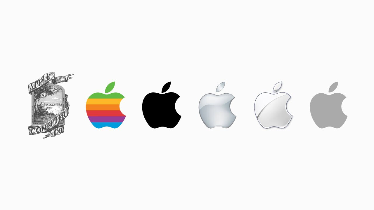
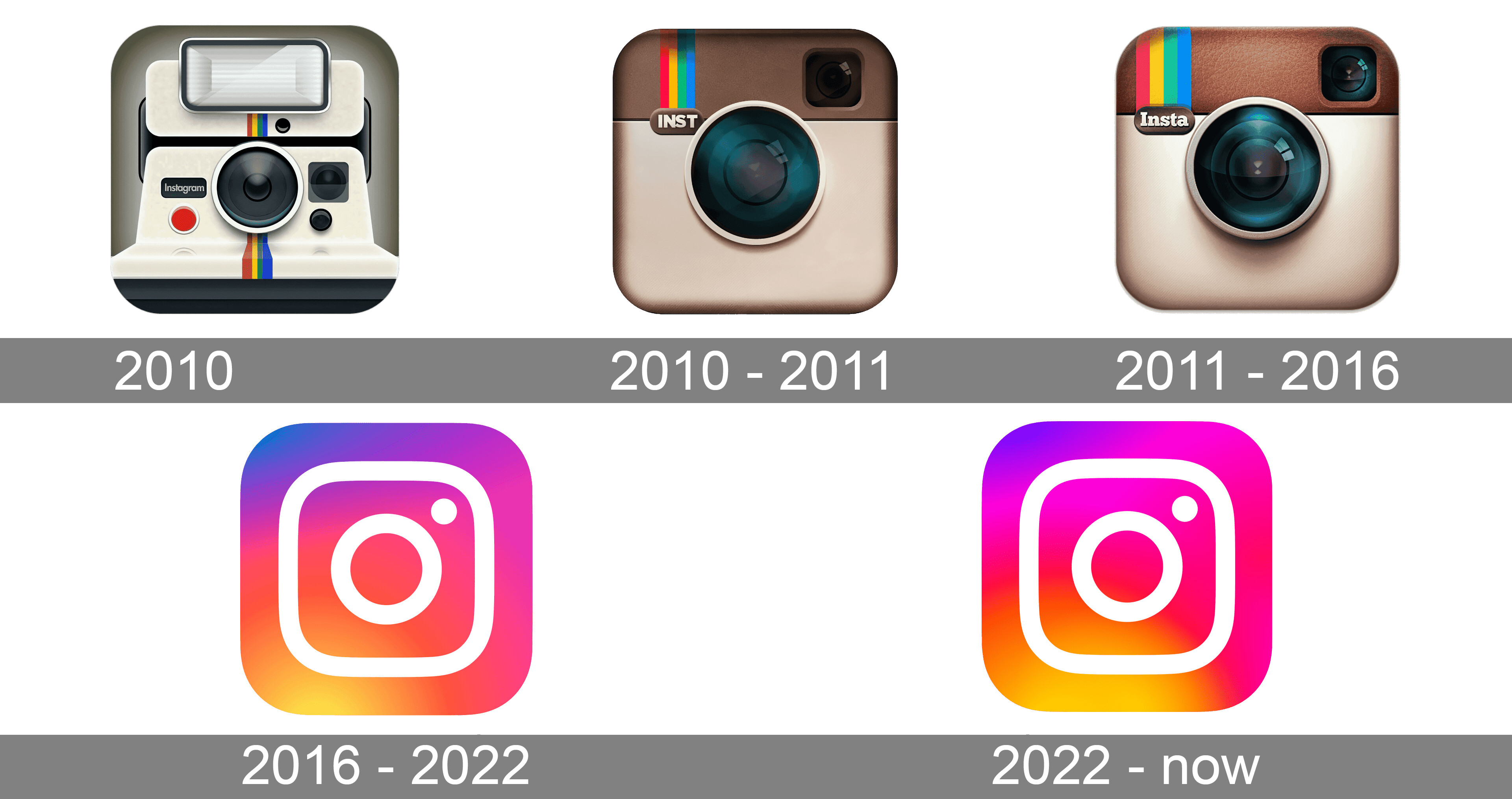
Yeah, well … I can’t say the new logos are worse than the old logos from early 2000s. But you’re correct, a minor logo change to Roblox or these other brands in a span of just a few years isn’t that big of a deal.

1 Like

Don’t cancel me for this, but I’m all for the simplification of logos, as long as they still maintain their distinct “properties”.

But the roblox one just makes me almost scared(?) might be my tyrophobia talking.

(I agree, the pringles thing is scary)

They have Fully Updated the Logo, I don’t Love it or Hate it…

2 Likes

i like the 2009 one for pringles

2006 logo was the absolute best.

1 Like