New Roblox Studio Icons - YUCK!

Roblox has recently updated all the icons found in Roblox Studio & oh boy are they disgusting.

image

It’s really hard to look at & I’ve heard very short-sighted people have troubles looking at this UI.

At the moment there are a few things you can use, my first option that I recommend is to use Vanilla 3, a very well-made icon pack.

If you don’t like this option there is still a way to revert back to the old logos - Head to beta features and disable “New Icons/ DPI aware Studio”.

You may lose out but if you’re desperate it’s the way to go.

What are your opinions on these logos? If you could change them back, would you?

Please share your opinions!

1 Like

This is how vanilla 3 looks:

image

I personally like the new logos.

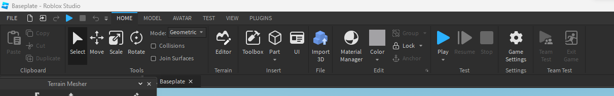
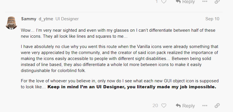
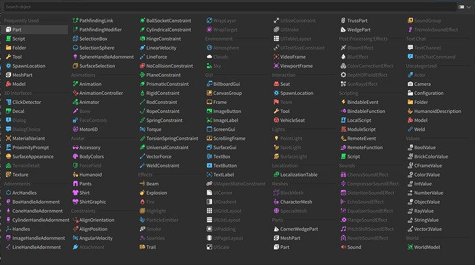
These don’t look terrible, although I think that I liked the old icons better & I can see how this could be an issue for folks who have sight troubles.

1 Like

I have to agree.

This is so bad, but at least it’s better than all the explorer icons being blue (if you remember when that was released). But I must agree with that statement, UI designing is impossible to do with these new icons it’s so confusing.

2 Likes

I personally agree I don’t think they look nice.

1 Like

I can’t really see the icons well, my eyes are that bad tbh. (I can still see the basic icons)

Don’t like them, I prefer to stay original, but I might change to vanilla 3 for the time being.

2 Likes

I agree with you. Vanilla 3 is a great icon pack.

I like the old icons much better, but I don’t hate this update like the last icon update (which most of the community didn’t like and ROBLOX reverted back to the old icons)

My theory why they did this change is because im pretty sure ROBLOX’s old icons were stolen from a source

1 Like