Opinions on the Roblox logos over time

Over time, roblox has changed there logo, a lot.

I personally recall the blue website theme and red logos.

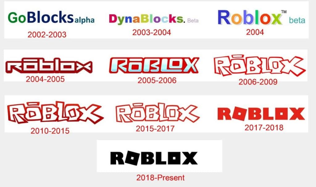
What is your favourite logo of the roblox franchise and why?

Mine is personally the red 2017-2018 one, it goes welll with the theme of roblox being fun and creative and doesn’t look outdated, I like the black logo, but I think it looks to “professional”, probably roblox trying to bring older players in by looking more modern & sleep.

2 Likes

I agree with you. I like the 2017-2018 and 2018-present one, they look modern.

I think the ROBLOX app on Windows (downloaded from Microsoft Store) has the red ROBLOX logo.

It does, they’ve forgotten to update it I think.

1 Like

I think the current one is the best. GoBlocks? DynaBlocks? :joy:

1 Like

The names they thought of before roblox. Can’t like, “Go Blocks” ix quite close to “Roblox”, if you say it out loud.

True, I just think the names are funny.

I wonder which guy came up with that.

1 Like

Lol. Perhaps the owner.

Ya, most likely and admin liek stickmasterluke or builderman :sunglasses:

Omg yes builderman, the most superior of roblox admins.

Owner = David Baszucki = builderman

Haha, yeh definitely one of the OGS.

ive been here since the 2015 logo was around and I think it looked nice for its time, the logo progresses to become more modern because at the time that was modern, I like the idea of the present one but my favorite was the 2006-2009