UI Testing | Feedback

Hello, Cookie Tech!

So I was in the middle of making a license centre for people who can control their licence after they have purchased and I wanted to get your opinions on it!

As you can see, I have used @cookie in there as an example of what it would look like for someone who has the license.

So, what can I improve on this? I look forward to hearing back from you!
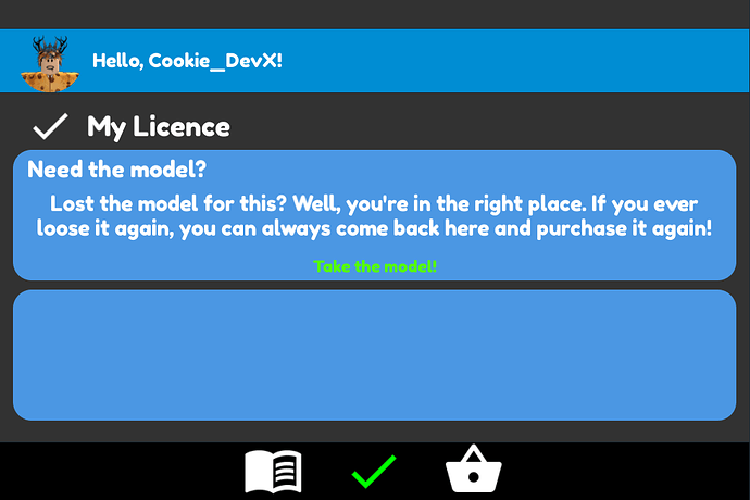
Looks very nice, but maybe space out the logos on the bottom bar.

The Checkmark(s) should be more round. Like down below:
image
(This is from Cookie’s Profile)

Why is the bottom box blank? I like the overall look

The bottom button box?

Ommm, yeah I think so. Are you gonna put buttons in it or is it just one
Big one?

It blank as I don’t want loads of button taking up the bar for a license centre.

Okay. That makes more since now @Deleted_User12