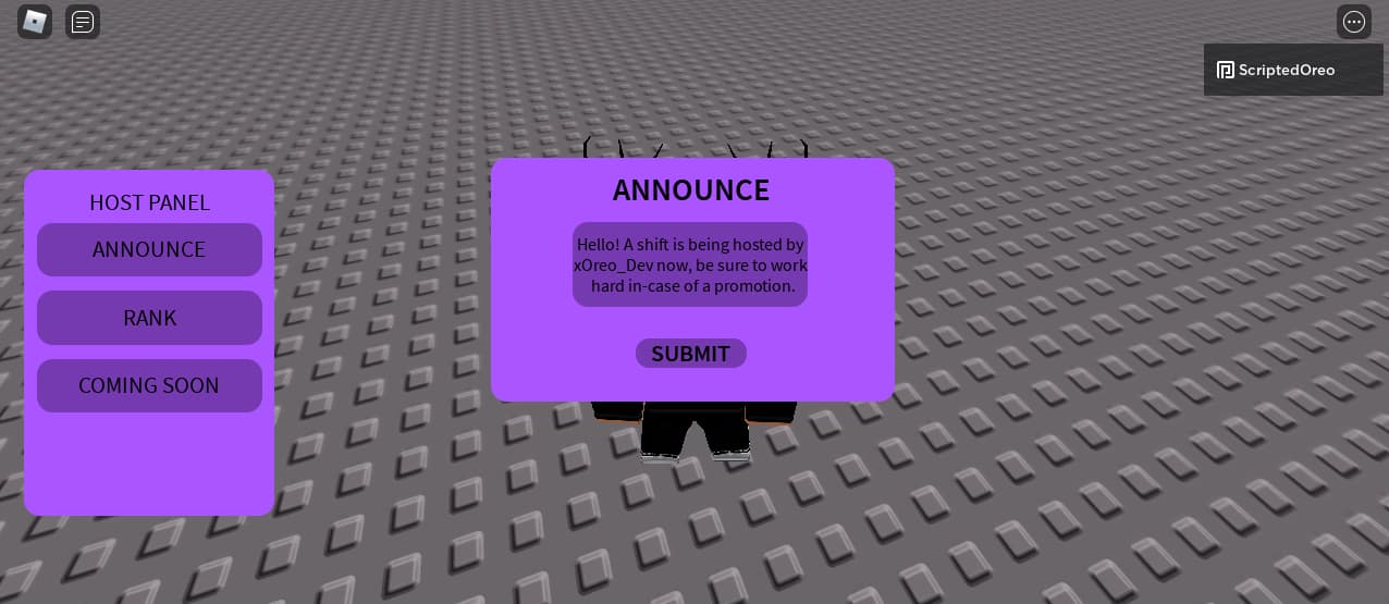
So today is my first day of UI design, and I’m very impressed with myself with this, but I wanted your feedback so I know what I can improve on.
This UI is yet to be finished and scripted, but I might need some help with that but I’ll let you know.
Thanks,
Oreo.
1 Like
Overall quite modern, not bad for a first try 
Perhaps consider changing the font for a more modern look, other than that it does look very modern and neat.
1 Like
It’s currently private, when it’s closer to the end of production, I’ll allow testing on it.
Noah
5
I like it, however, I don’t like the color scheme, maybe try having white text?
That’s a good idea, thank you!
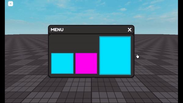
So while I’ve been working on another piece of UI, I have managed make the UI close with a little effect to it.
What are your opinions?
Noah
9
Is it going off screen cantered?
It looks like when it goes off the screen it goes slightly to the top right.
Wouldn’t be a bad plan checking that out.